Lesson: Laying Out Components Within a Container
Java 教程是为 JDK 8 编写的。本页中描述的示例和实践未利用在后续版本中引入的改进。
如何使用 GridBagLayout
注意: This lesson covers writing layout code by hand, which can be challenging. If you are not interested in learning all the details of layout management, you might prefer to use the
GroupLayout layout manager combined with a builder tool to lay out your GUI. One such builder tool is the NetBeans IDE. Otherwise, if you want to code by hand and do not want to use GroupLayout, then GridBagLayout is recommended as the next most flexible and powerful layout manager.
If you are interested in using JavaFX to create your GUI, see Working With Layouts in JavaFX.
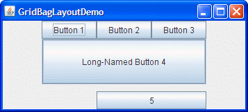
Here is a picture of an example that uses
GridBagLayout.
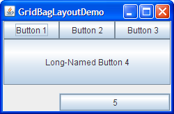
Click the Launch button to run GridBagLayoutDemo using Java™ Web Start (download JDK 7 or later). Alternatively, to compile and run the example yourself, consult the example index.
The code for GridBagDemo is in
GridBagLayoutDemo.java.
GridBagLayout is one of the most flexible and complex layout managers the Java platform provides. A GridBagLayout places components in a grid of rows and columns, allowing specified components to span multiple rows or columns. Not all rows necessarily have the same height. Similarly, not all columns necessarily have the same width. Essentially, GridBagLayout places components in rectangles (cells) in a grid, and then uses the components' preferred sizes to determine how big the cells should be.
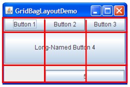
The following figure shows the grid for the preceding applet. As you can see, the grid has three rows and three columns. The button in the second row spans all the columns; the button in the third row spans the two right columns.
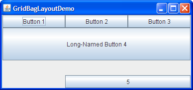
If you enlarge the window as shown in the following figure, you will notice that the bottom row, which contains Button 5, gets all the new vertical space. The new horizontal space is split evenly among all the columns. This resizing behavior is based on weights the program assigns to individual components in the GridBagLayout. You will also notice that each component takes up all the available horizontal space but not (as you can see with button 5) all the available vertical space. This behavior is also specified by the program.
The way the program specifies the size and position characteristics of its components is by specifying constraints for each component. The preferred approach to set constraints on a component is to use the Container.add variant, passing it a GridBagConstraints object, as demonstrated in the next sections.
The following sections explain the constraints you can set and provide examples.
Specifying Constraints
The following code is typical of what goes in a container that uses a
GridBagLayout. You will see a more detailed example in the next section.
JPanel pane = new JPanel(new GridBagLayout());
GridBagConstraints c = new GridBagConstraints();

//For each component to be added to this container:
//...Create the component...
//...Set instance variables in the GridBagConstraints instance...
pane.add(theComponent, c);
As you might have guessed from the above example, it is possible to reuse the same GridBagConstraints instance for multiple components, even if the components have different constraints. However, it is recommended that you do not reuse GridBagConstraints, as this can very easily lead to you introducing subtle bugs if you forget to reset the fields for each new instance.
注意: The following discussion assumes that the
GridBagLayout controls a container that has a left-to-right component orientation.
You can set the following
GridBagConstraints instance variables:
gridx,gridy- Specify the row and column at the upper left of the component. The leftmost column has address
gridx=0and the top row has addressgridy=0. UseGridBagConstraints.RELATIVE(the default value) to specify that the component be placed just to the right of (forgridx) or just below (forgridy) the component that was added to the container just before this component was added. We recommend specifying thegridxandgridyvalues for each component rather than just usingGridBagConstraints.RELATIVE; this tends to result in more predictable layouts. gridwidth,gridheight- Specify the number of columns (for
gridwidth) or rows (forgridheight) in the component's display area. These constraints specify the number of cells the component uses, not the number of pixels it uses. The default value is 1. UseGridBagConstraints.REMAINDERto specify that the component be the last one in its row (forgridwidth) or column (forgridheight). UseGridBagConstraints.RELATIVEto specify that the component be the next to last one in its row (forgridwidth) or column (forgridheight). We recommend specifying thegridwidthandgridheightvalues for each component rather than just usingGridBagConstraints.RELATIVEandGridBagConstraints.REMAINDER; this tends to result in more predictable layouts.注意:
GridBagLayoutdoes not allow components to span multiple rows unless the component is in the leftmost column or you have specified positivegridxandgridyvalues for the component. fill- Used when the component's display area is larger than the component's requested size to determine whether and how to resize the component. Valid values (defined as
GridBagConstraintsconstants) includeNONE(the default),HORIZONTAL(make the component wide enough to fill its display area horizontally, but do not change its height),VERTICAL(make the component tall enough to fill its display area vertically, but do not change its width), andBOTH(make the component fill its display area entirely). ipadx,ipady- Specifies the internal padding: how much to add to the size of the component. The default value is zero. The width of the component will be at least its minimum width plus
ipadx*2pixels, since the padding applies to both sides of the component. Similarly, the height of the component will be at least its minimum height plusipady*2pixels. insets- Specifies the external padding of the component -- the minimum amount of space between the component and the edges of its display area. The value is specified as an
Insetsobject. By default, each component has no external padding. anchor- Used when the component is smaller than its display area to determine where (within the area) to place the component. Valid values (defined as
GridBagConstraintsconstants) areCENTER(the default),PAGE_START,PAGE_END,LINE_START,LINE_END,FIRST_LINE_START,FIRST_LINE_END,LAST_LINE_END, andLAST_LINE_START.Here is a picture of how these values are interpreted in a container that has the default, left-to-right component orientation.
FIRST_LINE_START PAGE_START FIRST_LINE_END LINE_START CENTER LINE_END LAST_LINE_START PAGE_END LAST_LINE_END
版本说明: ThePAGE_*and*LINE_*constants were introduced in 1.4. Previous releases require values named after points of the compass. For example,NORTHEASTindicates the top-right part of the display area. We recommend that you use the new constants, instead, since they enable easier localization. weightx,weighty- Specifying weights is an art that can have a significant impact on the appearance of the components a
GridBagLayoutcontrols. Weights are used to determine how to distribute space among columns (weightx) and among rows (weighty); this is important for specifying resizing behavior.Unless you specify at least one non-zero value for
weightxorweighty, all the components clump together in the center of their container. This is because when the weight is 0.0 (the default), theGridBagLayoutputs any extra space between its grid of cells and the edges of the container.Generally weights are specified with 0.0 and 1.0 as the extremes: the numbers in between are used as necessary. Larger numbers indicate that the component's row or column should get more space. For each column, the weight is related to the highest
weightxspecified for a component within that column, with each multicolumn component's weight being split somehow between the columns the component is in. Similarly, each row's weight is related to the highestweightyspecified for a component within that row. Extra space tends to go toward the rightmost column and bottom row.
The next section discusses constraints in depth, in the context of explaining how the example program works.
The Example Explained
Here, again, is a picture of the GridBagLayoutDemo application.

Click the Launch button to run GridBagLayoutDemo using Java™ Web Start (download JDK 7 or later). Alternatively, to compile and run the example yourself, consult the example index.
The following code creates the GridBagLayout and the components it manages. You can find the entire source file in
GridBagLayoutDemo.java.
JButton button;
pane.setLayout(new GridBagLayout());
GridBagConstraints c = new GridBagConstraints();
if (shouldFill) {
                //natural height, maximum width
                c.fill = GridBagConstraints.HORIZONTAL;
}

button = new JButton("Button 1");
if (shouldWeightX) {
                   c.weightx = 0.5;
}
c.fill = GridBagConstraints.HORIZONTAL;
c.gridx = 0;
c.gridy = 0;
pane.add(button, c);

button = new JButton("Button 2");
c.fill = GridBagConstraints.HORIZONTAL;
c.weightx = 0.5;
c.gridx = 1;
c.gridy = 0;
pane.add(button, c);

button = new JButton("Button 3");
c.fill = GridBagConstraints.HORIZONTAL;
c.weightx = 0.5;
c.gridx = 2;
c.gridy = 0;
pane.add(button, c);

button = new JButton("Long-Named Button 4");
c.fill = GridBagConstraints.HORIZONTAL;
c.ipady = 40;      //make this component tall
c.weightx = 0.0;
c.gridwidth = 3;
c.gridx = 0;
c.gridy = 1;
pane.add(button, c);

button = new JButton("5");
c.fill = GridBagConstraints.HORIZONTAL;
c.ipady = 0;       //reset to default
c.weighty = 1.0;   //request any extra vertical space
c.anchor = GridBagConstraints.PAGE_END; //bottom of space
c.insets = new Insets(10,0,0,0);  //top padding
c.gridx = 1;       //aligned with button 2
c.gridwidth = 2;   //2 columns wide
c.gridy = 2;       //third row
pane.add(button, c);
This example uses one GridBagConstraints instance for all the components the GridBagLayout manages, however in real-life situations it is recommended that you do not reuse GridBagConstraints, as this can very easily lead to you introducing subtle bugs if you forget to reset the fields for each new instance. Just before each component is added to the container, the code sets (or resets to default values) the appropriate instance variables in the GridBagConstraints object. It then adds the component to its container, specifying the GridBagConstraints object as the second argument to the add method.
For example, to make button 4 be extra tall, the example has this code:
c.ipady = 40;
And before setting the constraints of the next component, the code resets the value of ipady to the default:
c.ipady = 0;
If a component's display area is larger than the component itself, then you can specify whereabouts in the display area the component will be displayed by using the GridBagConstraints.anchor constraint. The anchor constraint's values can be absolute (north, south, east, west, and so on), or orientation-relative (at start of page, at end of line, at the start of the first line, and so on), or relative to the component's baseline. For a full list of the possible values of the anchor constraint, including baseline-relative values,see the API documentation for
GridBagConstraints.anchor. You can see in the code extract above that Button 5 specifies that it should be displayed at the end of the display area by setting an anchor at GridBagConstraints.PAGE_END.
注意: The Tutorial's examples used to specify the constraints object a different way, which you might see in other programs as well. Rather than specifying the constraints with the
add method, our examples used to invoke the setConstraints method on the GridBagLayout object. 例如:
GridBagLayout gridbag = new GridBagLayout();
pane.setLayout(gridbag);
...
gridbag.setConstraints(button, c);
pane.add(button);
Container.add method since it makes for cleaner code than if you were to use setConstraints.
Here is a table that shows all the constraints for each component in GridBagLayoutDemo's content pane. Values that are not the default are marked in boldface. Values that are different from those in the previous table entry are marked in italics.
| Component | Constraints |
|---|---|
| All components |
ipadx = 0 fill = GridBagConstraints.HORIZONTAL |
| Button 1 |
ipady = 0 weightx = 0.5 weighty = 0.0 gridwidth = 1 anchor = GridBagConstraints.CENTER insets = new Insets(0,0,0,0) gridx = 0 gridy = 0 |
| Button 2 |
weightx = 0.5 gridx = 1 gridy = 0 |
| Button 3 |
weightx = 0.5 gridx = 2 gridy = 0 |
| Button 4 |
ipady = 40 weightx = 0.0 gridwidth = 3 gridx = 0 gridy = 1 |
| Button 5 |
ipady = 0 weightx = 0.0 weighty = 1.0 anchor = GridBagConstraints.PAGE_END insets = new Insets(10,0,0,0) gridwidth = 2 gridx = 1 gridy = 2 |
GridBagLayoutDemo has two components that span multiple columns (buttons 4 and 5). To make button 4 tall, we added internal padding (ipady) to it. To put space between buttons 4 and 5, we used insets to add a minimum of 10 pixels above button 5, and we made button 5 hug the bottom edge of its cell.
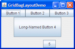
All the components in the pane container are as wide as possible, given the cells that they occupy. The program accomplishes this by setting the GridBagConstraints fill instance variable to GridBagConstraints.HORIZONTAL, leaving it at that setting for all the components. If the program did not specify the fill, the buttons would be at their natural width, like this:
When you enlarge GridBagLayoutDemo's window, the columns grow proportionately. This is because each component in the first row, where each component is one column wide, has weightx = 0.5. The actual value of these components' weightx is unimportant. What matters is that all the components, and consequently, all the columns, have an equal weight that is greater than 0. If no component managed by the GridBagLayout had weightx set, then when the components' container was made wider, the components would stay clumped together in the center of the container, like this:
If the container is given a size that is smaller or bigger than the prefered size, then any space is distributed according to the GridBagContainer weights.
Note that if you enlarge the window, the last row is the only one that gets taller. This is because only button 5 has weighty greater than zero.
The GridBagLayout API
The GridBagLayout and GridBagConstraints classes each have only one constructor, with no arguments. Instead of invoking methods on a GridBagConstraints object, you manipulate its instance variables, as described in Specifying Constraints. Generally, the only method you invoke on a GridBagLayout object is setConstraints, as demonstrated in The Example Explained.
Examples that Use GridBagLayout
You can find examples of using GridBagLayout throughout this tutorial. The following table lists a few.
| 例子 | Where Described | Notes |
|---|---|---|
GridBagLayoutDemo |
This section | Uses many features weights, insets, internal padding, horizontal fill, exact cell positioning, multi-column cells, and anchoring (component positioning within a cell). |
TextSamplerDemo |
使用文本组件 | Aligns two pairs of labels and text fields, plus adds a label across the full width of the container. |
ContainerEventDemo |
如何编写容器监听器 | Positions five components within a container, using weights, fill, and relative positioning. |